

To see why, a brief glance at the latest figures on Italy’s mobile-internet market should suffice. Even though there is still a long way to go, in the 2 years 2012–2013, web use on mobile devices grew exponentially, stimulating new business and cementing the success of traditional e-commerce sites, too.
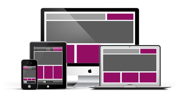
The range of formats and resolutions to grapple with is swelling day by day, forcing website builders to adapt continually.
The need for templates that display properly on mobile devices, too, is clear: remember the last time you tried to access a site on your smartphone and it was so hard to see that you had to pinch to zoom – you probably gave up and headed for a competing website that was easier to use. A great many potential leads are lost like this.
In practical terms, then, we have an opportunity to abandon the traditional web architecture, whose methods and dimensions tend to be predefined for viewing on a desktop PC.
Efforts to address these problems have led to responsive designs: web designs that can adapt to the browser dimensions, automatically resizing to keep the content optimally readable and usable.
It is a real revolution in the web arena, because it has also brought a radical change in the underlying approaches to website architectures.
The innovative germ at the heart of these templates is the fluid grids, which we can think of as a progression from the liquid layouts, which had already become the latest big thing.
In this case, rather than designing a layout based on a fixed number of pixels or on adjustable percentage values, we work in terms of proportions: when a layout is displayed in a small space (as on a mobile device) or is enlarged on a smart TV, all its component elements are resized and repositioned.
A good free responsive template doing the rounds is Oxygen, which is compatible with Joomla versions 2.5 and above and is fully tailorable.
Joomla supports customisation of multiple parameters; with responsive templates, many of them can be set up to suit your specific needs.
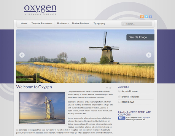
This template is supremely versatile, making it ideal for developing a wide variety of sites: the modules can assume as many as 48 different positions, and there are 100 fonts and 3 colour variants, so the combinations are practically endless.
After downloading the template from the developer (www.joomla51.com/free-templates), go to the template’s control panel; from the top menu bar, select Extensions --> Template Manager --> Your Template Style.
Note that, when you install a template for Joomla, the system attributes the defined style as the default for that template.
You can get around this limitation simply by using the "Save as" function. That way, you can define several styles to assign to different pages of the site via the Assignment tab in the menu.
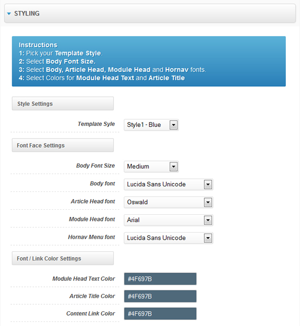
All the main parameters are editable directly from the Template Manager page, starting with the style, which you can set up by choosing from the options in the drop-down menu.
These include the fonts – 14 WebSafe fonts and over 100 Google fonts – allowing you to fully personalise every element of the page, from the body to the title of the article or module. Of course, you can also choose their colours.
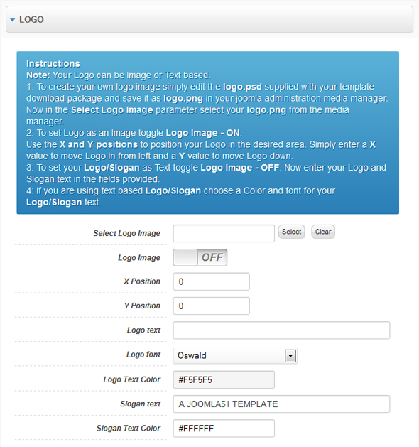
In the Template Manager’s Logo section, you can set the parameters for the website logo and title, to exercise total control over arguably the most vital element of any webpage. To load your image, just click on the Select Image field and then position the logo within the page.
If you prefer a text-based logo, the template also lets you deactivate the image option: in this case, the logo will be replaced by the text that you enter (along with the brand slogan, if any), which you can then amend by choosing the font and colour via the dedicated selectors.
As for the Layout Options, there is no need to set the sizes of the elements manually: the default values will be adjusted automatically according to how many modules have been defined and positioned on the same line. The default regime can be disabled, if you wish to define the width of each individual page element yourself.
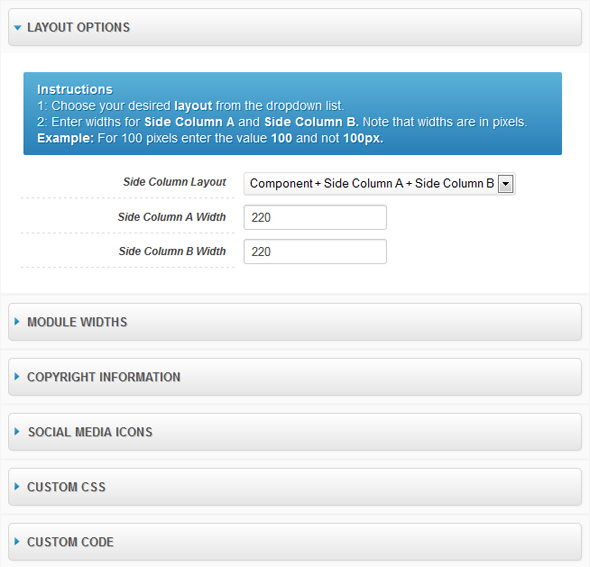
Finally, you can position the side columns in the layout on both sides or just one, to the right and/or left of the area dedicated to the content, choosing their respective widths.
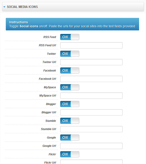
Naturally, multimedia content and social pages can also be added (simply enter the relevant URL).
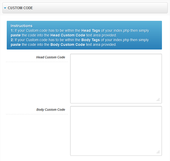
For specific purposes – e.g. for Google Analytics – it can be handy to add text bands both at Head level and in the template body, using the dedicated fields provided.
Since this is a responsive template, as we have mentioned, it is also mobile friendly and adjusts automatically to different devices.
Img courtesy of Oxygen.


